

StickerYou Blog
5 Design Tips for Print
September 20, 2022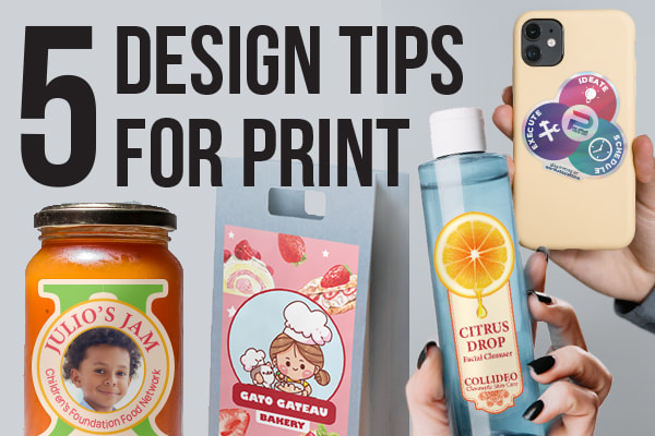
Share this post:
We make it easy to order custom products for your business in just a few clicks, but today, we’re making it even easier.
Check out these 5 tips to consider when designing stickers and labels for print, to ensure you receive top-notch products to promote your brand!
Tip #1 - Use high resolution artwork to get a crisp, clean result post-print
This first tip may just be the most important one, so listen up! When creating and uploading imagery for print, the resolution of your images and designs determines how crisp your artwork will look upon being printed.
We recommend a resolution of 150 ppi (pixels per inch) for small-format products (stickers, labels, temporary tattoos, etc.), and a resolution of 75 ppi (pixels per inch) for wide-format products (various decals, signage, etc.). These thresholds are put in place in order to ensure you don’t receive products that are blurry, pixelated, or less-than perfect!
Tip #2 - Consider the size you’re printing your designs at to avoid cluttering or overcomplicating your artwork
One common mistake we often see is busy, cluttered artwork - especially when it comes to smaller sized products such as stickers and labels. When designing your custom products, it’s important to consider what final size you would like them to be.
Doing this will ensure you’re not filling space with too many elements, and will avoid issues such as illegible text and elements that cannot be fully understood. Consider taking the “less is more” approach when creating smaller sized products. Alongside this, double check your text point size and line thickness on all graphic elements. If you’re testing out a new design, you can even print a prototype product on some standard computer printer paper to fully proof your artwork at print size.
Tip #3 - Limit your color palette, keeping things neat and easily digestible
When it comes to products, color can be your best friend or your biggest enemy. It’s crucial to keep things simple, and consider how many colors you’d like to incorporate. This is particularly important when creating products for branding or packaging.
Consider having your “brand” color (such as our infamous StickerYou blue) as the forefront tone, and add additional colors sparingly. This will allow your designs to be consistently branded, and will help retain top-of-mind awareness when your audience interacts with your products!
Tip #4 - Don’t overlook your typography, select fonts that can be read easily and flow in unison
Throughout your custom product journey, you may hear print-savvy individuals use the term “print typography”. Print typography refers to how different fonts look when they’re printed, as this can slightly change when viewing fonts on-screen.
For print, it’s best to avoid overly complicated fonts - this includes fonts that are extremely thin, overly embellished or script-y, or cluttered and intricate in general. Stick to simple fonts, and select fonts that pair well together. This will ensure your audience can easily read and understand your message, without having to decipher any tricky typefaces!
Tip #5 - Bleed the edge of your design past the die-cut to steer clear of any white lines or misalignment around your products
The term “bleed” refers to extending the background of your design past the die-cut line. This ensures that in the event of slight shifting when your products are being cut, there will not be any white lines or unfinished edges on your borders.
We always recommend extending your design a bit outside of the die-cut shape when possible. We also offer a background color tool with an eye-dropper, which you can use to color match and extend any current background you have in your artwork and manually create a bleed!
Want more great ideas and inspiration? Follow us on social, or sign up for our newsletter for amazing deals delivered directly to your inbox.
StickerYou blog posts are written and published by members of the StickerYou team at our headquarters, located in the beautiful city of Toronto, Canada.
Follow us
Featured Posts
Packaging & Branding
- 9 Creative Ways To Use Roll Labels
- Introducing: Image Transfer (DTF) Iron-Ons
- Introducing: Image Transfers
- No More Boring Packaging
- Perfect Your 2023 Branding
Tips & Tricks
- 5 Ways To Refresh Your Brand’s Identity
- Permanent Stickers: The Adhesive That Won’t Quit
- How to Make Holographic Stickers: A Guide to Iridescent Custom Designs
- 5 Sophisticated Mother’s Day Gift Ideas
- Creating DIY Travel Keepsakes
Customer Spotlight
- Customer Spotlight: Juicery Harlem | StickerYou
- Customer Spotlight: Horseshoe Valley Resort Geared Up for Crankworx with StickerYou 🚵♂️
- How to Start a T-Shirt Business at Home Using DTF Iron-On Transfers from StickerYou
- Genshin Impact x StickerYou Collaboration
- The Power in Pages
Innovation
- Benefits of StickerYou for Custom Products
- Permanent Stickers: The Adhesive That Won’t Quit
- 5 Creative Ways Brands are Using Custom Fuzzy Stickers
- How to Start a T-Shirt Business at Home Using DTF Iron-On Transfers from StickerYou
- Introducing: Image Transfer (DTF) Iron-Ons
Guides/Tutorials
- Benefits of StickerYou for Custom Products
- How to Make Holographic Stickers: A Guide to Iridescent Custom Designs
- 5 Sophisticated Mother’s Day Gift Ideas
- The Ultimate Guide to Label Materials: Which Finish Fits Your Vision?
- 5 Quick Tips to Get Your Artwork Print-Ready